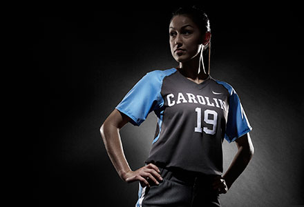
Nike unifies Carolina’s brand
In partnership with Nike, UNC Athletics refreshed its marks and colors to create a consistent look to one of the most recognized brands in college sports.

Todd Van Horne has been part of Nike’s brand identity process for more than 30 teams and schools. He was there when the company helped the Denver Broncos completely remake their logo and marks in 1996, he was there last week when Army transitioned to Army West Point and introduced its own brand and identity system, and he was there for dozens of changes in dozens of places in-between.
But Van Horne, the global creative director at Nike, had never been part of a brand identity process quite like the one that began at Carolina in the fall of 2013.
Van Horne is accustomed to working with schools that need a new brand, that need an identity that will set them apart in college athletics. When he arrived in Chapel Hill, he found that Carolina already had that.
“When we got into this, we found there was so much passion and equity around certain elements at Carolina that other universities would crave,” Van Horne said. “You have your own Carolina blue, and there is so much equity in that. People see that blue and they can’t think about anything but Carolina. There is the interlocking NC, which is so distinctive and has so much history.”
So Van Horne knew the process, which would eventually last around 18 months from start to Monday night’s unveiling at the Rammys, would not require Nike to invent a new identity for the Tar Heels. The company calls their logo and mark redesigns a “brand identity system,” and it’s an intensive process that begins with an extended campus visit, then continues with Nike and the school exchanging ideas on the best way to achieve the goals of creating a unified brand.
As the Nike group worked to learn more about Carolina, they met with a campus historian, took campus tours, and talked with a cross-section of the athletic department. That final group included head coaches and student-athletes.
“Being able to give my input to people who wanted to learn more about the University was really enjoyable,” said men’s track senior Devon Carter. “They really keyed in when I mentioned my head coach (Harlis Meaders) had been talking about ‘A Better Blue.’ We talked more about that and what it means to us.”
“You start to hear common themes,” Van Horne said. “People may use different words to describe the themes, but the common sentiment comes out. You’re just combining the emotions and passions you hear from them with the history that adds another piece of it.
“I’ve been doing this about 25 years. I have never heard as many students and student-athletes use the word ‘love’ when referring to their University. That was very powerful.”
The Brand Identity Group had numerous exchanges with an athletic department task force, and after narrowing the tweaks and changes that would be made, the process moved to taking the ideas off paper and putting them on uniforms, signage and tangible ways the logos and marks would be used.
“The goal of any identity program is for a person from anywhere in the country to see just a glimpse of your mark and know immediately who you are and who you’re representing. With Carolina, because of the power of the Carolina blue and the interlocking NC, it was more of an editing process and consistency process rather than creating a bunch of new marks.”
So the many permutations of the NC—sometimes even across the same uniforms for a specific sport—are gone and one unified NC will be used across the department. No longer should you encounter a rack of Carolina t-shirts with a rainbow of “Carolina blue” hues. Argyle will expand from men’s basketball to the rest of the athletic department, the strutting ram is officially back in play, and there’s a unique typeface that will be used on all athletic department gear.
Some of the changes will be so nuanced as to require a trained eye to spot them. But their long-lasting impact—Van Horne says a brand identity refresh is designed to last forever, with only the way the school chooses to market around the logos and marks changeable from year to year—will be visible on courts and fields for years to come.
“At some point, I’ll see the uniforms on TV when I’m watching a game, and I can say, ‘Hey, I was there when they created that,’” Carter said. “That will be awesome to know I was part of that and gave something back to the University other than just my athletic and academic talents. This is something that will carry on forever.”
More from GoHeels.com:
- Carolina athletics and Nike refresh Tar Heel’s brand identity
- Carolina Athletics branding guidelines
- Carolina marks and logos
- Photo gallery: 2015 brand refresh (uniforms)
- Photo gallery: Updated marks and logos


